Tuesday, 11 May 2010

Double page spread steps

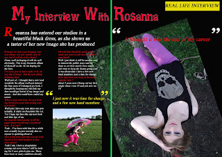
Here is my first screen caption of my double page spread, i have used a black background with a red title and a picture of my model on the right hand page on a tilt, i chose it this was as i thought it would catch the readers eye more.
here is my final page i have addes a conversation which has gone on between the writter of the magazine and my model Rosanna. i have used enlarged quotes and quotation marks as i think this is important to attract the readers attention.

Contents page steps

Here is my first screen caption, here i have added a black background and added a yellow strip onto the page with red writting in the same font as the title, and the date and issue number at the top.


Here i have added all the contents of which is in the magazine i have used Red and yellow strips with the writting on to of it. This was to enhance the writting to the reader.

i have enlarged to page number to inform to reader of which pages they are on.

I have also added a strip at the bottom which informs the reader of the website for the magazine and that the
magazine is the UK's number one selling magazine 2010.
Here is my final outcome of my contents page i have added an image at the bottom right hand corner of the front page and added other images so that the readers can get an idea of what is inside to magazine.

Front page steps

Here is the first image that i entered into photoshop, as i was going to use this for my front page. However i then had to add in a title and other pictures and tag lines etc.


Here is my second print screen of my front page, i have put in the tag lines in red however they were hard to find so i added a black background so they were easier to see.


Here i have added my title Rock Scene. i have done this in the same style to the tag lines with the red writting and the black background.


here i have added a competiton to the page with a gold coloured star and black writting.


Here i have added another image into the bottom right hand side of the page as this will interest the viewers as they get an idea of what is inside.


here i have added a pug line which represents with the picture, i have done this in different colour so that it will interest the custumers more. I have also added a bar code and the price at the bottom too.


My Double Page Spread


My Contents Page


My Front Page


Photo group 3


here i have completly changed her outfit to a black outfit as i felt that this would make her face look even paler if i done this, and i placed her with a guitar to give a more "rock" impression.


photo group 2


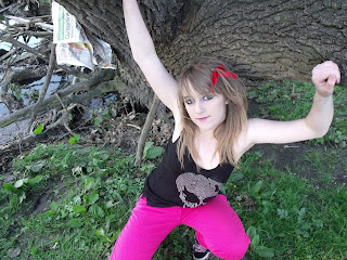
Above are another set of images, this time i have changed the colour of her jeans to make the picture more brighter and i have placed her differently around the tree and in a field to create the image she was going to a music festival.

Photo Group 1


These are my first group of pictures which i took i decided to dress her in brightly coloured jeans and a dark black top, with pale makeup and dark eyes. This was to give the look of a Rock chick!
I decided to use the background of a tree as i thought this would be effective.

Questionnaire Results

Looking at my final results from my questionnaire, this will have some inpact on the final outcome of my designs to my Front Page, Contents Page, and Double page spread.. below is the final results.

1)

Age


Here we can see that the most popular age that answered to my questionnaire was ages 17-19 therefore I will be aiming my music magazine at the more younger generation as to the older generation, in my magazine I will include things which I think will interest this age more, therefore I will carry on to see the rest of the results.

2)

Which Sex Are You?

Although the most popular group for my questionnaire was female I will overall be aiming my magazine at male and female as I feel that my ideas would interest them both. Also although I know that females are more likely to read a magazine it would also be nice that my magazine allows boys to read it too.

3)

How Often Do You Read Magazines?


Here it shows that magazine are most likely to be read weekly I will make my magazine be issued each week instead of daily or monthly.

4)

How Much Would You Spend On Magazines?

Here it shows that the most popular price range would be between £1-£2, therefore when creating my magazine I will include a price which is in this price range.

5)

What Draws Your Attention To A Magazine


When it comes to designing the layout i will make sure I take into consideration the Pictures which i use and make sure that the text is bold and bright and finally that there is a competition to be won on the front.

6)

What would you mostly want to read about?


Here is a very mixed view on which should be in my magazine therefore when creating my contents page I will make sure that all of the above features are included into my magazine.

7)

What music genre do you prefer

Here it shows that the most popular music genre is Dance, however for my magazine I will be do Rock music.

8)

Which title do you prefer?

Above this shows that there is a mixed decision when it comes to my titles, however I have decided to choose the last one, however I am going to change it to "Rock Scene"

9)

Which Colour Scheme Do You Prefer?

Above shows that the most favourite colour scheme to use would be Red & Black or silver & Black, I am going to do my magazine in Red & Black however I am going to add a gold colour into it too.

10)

Which style font do you prefer?

Here we have a clear favourite on font, however I have chosen another font which I feel suites the magazine better.