
Tuesday, 11 May 2010

Photo group 3

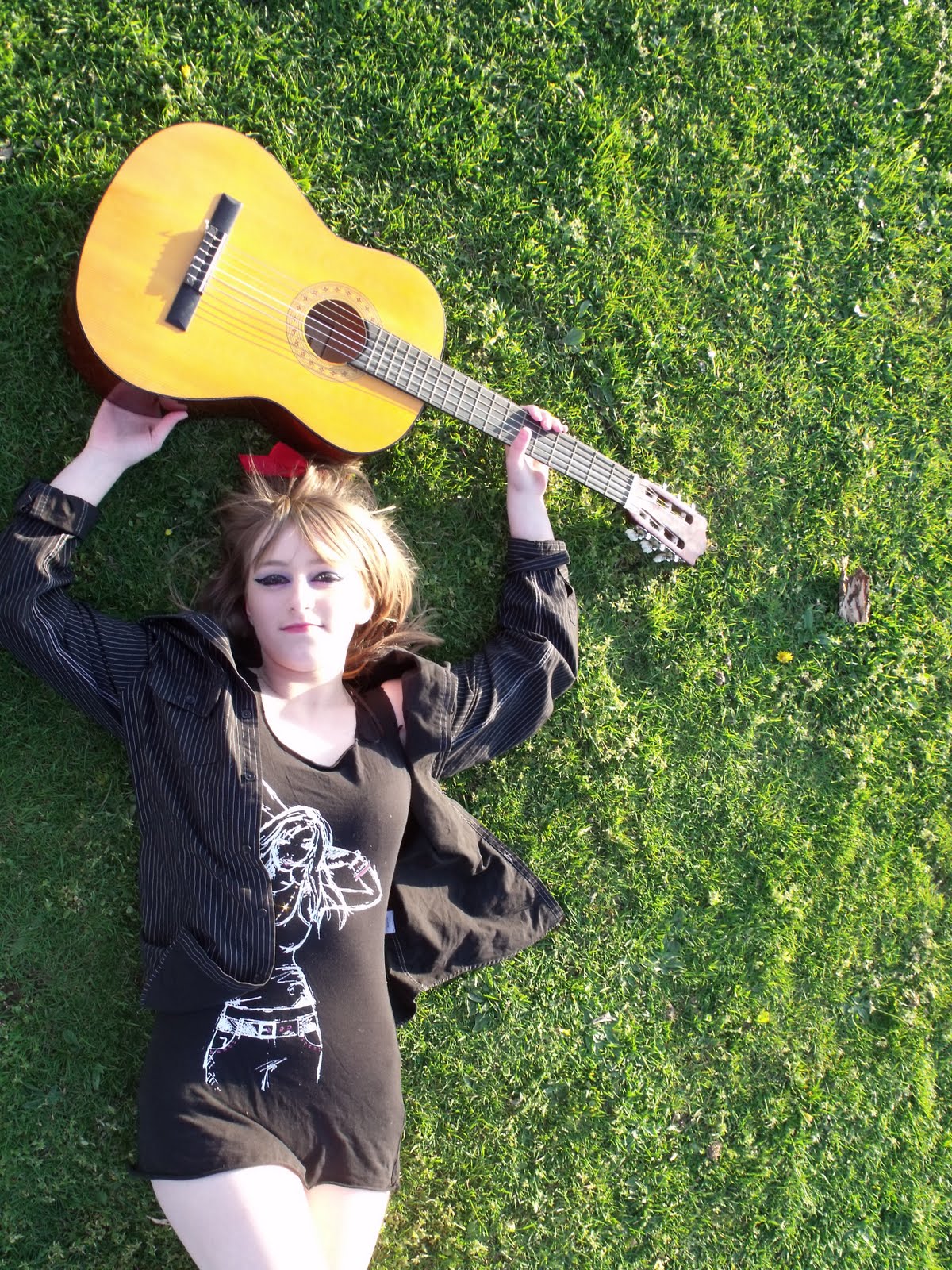
here i have completly changed her outfit to a black outfit as i felt that this would make her face look even paler if i done this, and i placed her with a guitar to give a more "rock" impression.
photo group 2


Above are another set of images, this time i have changed the colour of her jeans to make the picture more brighter and i have placed her differently around the tree and in a field to create the image she was going to a music festival.
Photo Group 1


These are my first group of pictures which i took i decided to dress her in brightly coloured jeans and a dark black top, with pale makeup and dark eyes. This was to give the look of a Rock chick!
I decided to use the background of a tree as i thought this would be effective.
Questionnaire Results
Looking at my final results from my questionnaire, this will have some inpact on the final outcome of my designs to my Front Page, Contents Page, and Double page spread.. below is the final results.

1)
Age
Which Sex Are You?
How Often Do You Read Magazines?
How Much Would You Spend On Magazines?
What Draws Your Attention To A Magazine
What would you mostly want to read about?

Thursday, 22 April 2010
Preliminary Task
Below you can see my preliminary task which was to make a magazine for Goffs School my aim was to make a front page and contents page which resembles Goffs School. I starting this task of by doing a lot of brainstorming , I brainstormed the possible colours of my magazine, picture ideas, stories i could include and the title of my magazine. I then was asked to sketch out different styles of magazine front covers and contents that i could use. This was quite useful as it allowed me to create an image of what my magazine front cover and contents page could look like. It was also good as it showed me what looked right and what didn't look as good.
The last part of preparing was the most difficult bit as this was to take the photos and decide the background you was going to include, getting the lighting right etc.. For this i decided to take some of our school netball team and other various pictures of different classes doing their work. Now all the preparing was done it was time to create it. After all the brainstorming i decided i was going to use the colour blue as this would match with the school logo and house style very well.
When making my front cover and contents page i was told to use Photo shop which I found very difficult however I managed to complete this. The problems I had during this task were firstly, taking the actual pictures as I wasn't sure what to at first with the background etc.. Secondly I found placing my pictures and text on the front cover and contents page hard as i wasn't sure which looked better. Another problem i had was re sizing the images I wanted on my pages as photo shop wasn't allowing me to do this so in the end I had to make do with the size they already was.
This is my preliminary task front cover

This is my contents page

Wednesday, 21 April 2010
Initial ideas for photos
Below is some different pictures which I have found on google and I really liked them. When it comes to taking my own pictures I will take into consideration the pictures I have found and use them when taking my pictures.
 I got this picture off the Internet and I really like this picture as this matches to the story ideas I have. This is a picture of boys at a festival dressed in their rock clothes and ready to listen to the music at the festival. If i was to do my pictures simular to this i would use the same layout of the boys in a field but i would add more insturments to the picture for example a guitar etc.

I really like this collage of photos as each picture is different but resembles rock. In my magazine i would like to use this idea and take various different pictures of different things and add them together to make one picture, which is very eye catching and stands out on the page. I also think this picture is very eye catching as the maker of this picture has added text to it in all different fonts and this would appeal to the audience more as it is something to read.

I really like this picture, however if I was to do a similar picture I obviously wouldn't be able to get the same background therefore I could take the image myself but edit it in Photoshop and insert a background which I think would be suitable for the picture. I really like the way she is dressed outrageously and she has a guitar in her hand which she is playing I think this is a very good example of a rock picture.
 This is one of my favourite images as I think they have taken the picture from a very unique angle and i really like the way her facial expressions are asthough she is shouting. I also like the way they have done her hair, as this looks very rock like. And finally I like the way they have edited her face with lots of other images which are blurred out on her face. However I think this image would be very difficult to do. Finally i like the way they have added text into the picture.
 This is the sourt of image i will be adding into my magazine as a little image on my contents page just to fill up the space and to make it look more rock!. I also plan to use a lot more pictures like this on to my contents page.

 I got this picture off the Internet and I really like this picture as this matches to the story ideas I have. This is a picture of boys at a festival dressed in their rock clothes and ready to listen to the music at the festival. If i was to do my pictures simular to this i would use the same layout of the boys in a field but i would add more insturments to the picture for example a guitar etc.
I really like this collage of photos as each picture is different but resembles rock. In my magazine i would like to use this idea and take various different pictures of different things and add them together to make one picture, which is very eye catching and stands out on the page. I also think this picture is very eye catching as the maker of this picture has added text to it in all different fonts and this would appeal to the audience more as it is something to read.

I really like this picture, however if I was to do a similar picture I obviously wouldn't be able to get the same background therefore I could take the image myself but edit it in Photoshop and insert a background which I think would be suitable for the picture. I really like the way she is dressed outrageously and she has a guitar in her hand which she is playing I think this is a very good example of a rock picture.
 This is one of my favourite images as I think they have taken the picture from a very unique angle and i really like the way her facial expressions are asthough she is shouting. I also like the way they have done her hair, as this looks very rock like. And finally I like the way they have edited her face with lots of other images which are blurred out on her face. However I think this image would be very difficult to do. Finally i like the way they have added text into the picture.
 This is the sourt of image i will be adding into my magazine as a little image on my contents page just to fill up the space and to make it look more rock!. I also plan to use a lot more pictures like this on to my contents page.
Here is a picture of a man with a guitar who looks like he is performing at a concert or gig. I like the way the man has been costumed with the deadlocked hair and rough looking hairy face. and the clothes that he has been put in, in my magazine I would like to use this picture to to influence my picture as I like the way he has been photographed.
Subscribe to:
Posts (Atom)