
Tuesday, 11 May 2010
Double page spread steps

Contents page steps

Front page steps


here i have added a pug line which represents with the picture, i have done this in different colour so that it will interest the custumers more. I have also added a bar code and the price at the bottom too.
photo group 2
Questionnaire Results
Age
Which Sex Are You?
How Often Do You Read Magazines?
How Much Would You Spend On Magazines?
What Draws Your Attention To A Magazine
What would you mostly want to read about?
What music genre do you prefer
Which title do you prefer?
Which Colour Scheme Do You Prefer?
Which style font do you prefer?

Thursday, 22 April 2010
Preliminary Task


Wednesday, 21 April 2010
Initial ideas for photos


I really like this collage of photos as each picture is different but resembles rock. In my magazine i would like to use this idea and take various different pictures of different things and add them together to make one picture, which is very eye catching and stands out on the page. I also think this picture is very eye catching as the maker of this picture has added text to it in all different fonts and this would appeal to the audience more as it is something to read.

I really like this picture, however if I was to do a similar picture I obviously wouldn't be able to get the same background therefore I could take the image myself but edit it in Photoshop and insert a background which I think would be suitable for the picture. I really like the way she is dressed outrageously and she has a guitar in her hand which she is playing I think this is a very good example of a rock picture.


Initial Ideas For Font

I think this font would be good for my magazine as it is very "Rock" looking as the writting is very weird and each letter is different and has different instruments in it. i also like it as it automatically caught my eye when i see it.

When i saw this font i wasnt sure if i liked it or not however i decided to add it to my ideas as it is very different and has different meanings, although the title of the magazine will be in this font the font is also made to look like it is made out of rock therfore has multiple meanings and shows the audience that the genre of music is rock if they wasnt already sure.
Style 3

I really like this font as it is quite simple but in a way is scary looking. i think this font would work well with the image of magazine i have in mind. i would be stretched across the top of the magazine and be in black.
Style 4

This font is one of my favourite fonts as it is very simple and plain however would stand out very well as a heading on my magazine againt i would have it stretched across the whole of the top of the page and have it in black i think it would look very mysterious and unique.

Here are some of the different fonts that I will be including into my magazine I will use a various amount of different fonts as I think the more fonts that are shown the more this will catch the audience eye. As they have more to look at for example, bold text and bigger text than other text. I will just use a various different amount of texts. i really like ICT BOOKMAN DEMI as i think this is very simple however looks very stylish and attractive. I also like PALATINO as it is very different and you dont usually see this font on magazines very often. And i also very like AVANTE GARDE as this is again very simple and straight forward however would look very good in bold and would catch the viewers eye.
Initial Ideas For Colour Schemes
Luminous Green and Black - I think these colours would work well together as they are very bright colours and would catch your eye very well and I have never seen this colours schemes used before therefore would be unique and different.
Silver and Black - When I picture these colours together I think they would work very well and they would stand out and look very stylish and glamorous however could be a bit dull.
Black and Gold - I think these colours would look very stylish and expensive and would go well with rock music as I would have a brown and black guitar on the front and the gold and black heading would go very well with the front cover image.
Maslow Hierarchy Of Needs

Initial ideas for stories
Glam Rock! - This story would be the biggest story advertised on the front page with the main girl looking very glamorous with all the latest fashion accessories on (to show that the girl has took tips from the magazine). And inside on the double page spread would be how to transform your old look into a new more glamorous rock chick image.
The Big Interview! - This story would obviously be about a girl called Rosanna who is being interviewed by the magazine there would be a picture of Rosanna on the front looking very happy also with large text on the front as this would encourage the public to buy the magazine even more, And inside on the double page spread there will be an interview which will be laid out in collums with a big picture of Rosanna.
Music Festival Madness - This story would be about a specific festival that went on a few weeks ago this story would have all the latest gossip in it about the music festival and all the madness that went on. On the front page there will be a group of people standing over a field getting ready to watch the music from the festival and on the double page spread their will be another few pictures that show they are at the festival which columns of writting about it.
Initial ideas for title
Metallica - This would be a good name for a rock magazine as the name, which is shown, is one word and sounds classy and unique, it is easy to say and would stand out. I also think it is a good name as the type of music my magazine would specialize in would be rock music and the title would represent metal music and this relates very well to rock music.
Blood On The Tracks - I thought of this title as it would relate to rock music good as the tracks part would represent a track being a song track and blood would represent the people that listen to rock music as they tend to like blood and are very outrageous people.
Rock Sound - This title is very simple and means exactly what it says, i think this would be a good title as again it is very simple and could stand out very well on the page as it is two words so it could take up most of the top of the page. The name represents with the genre of the magazine as the genre is "rock" music and "sound" would represent the sound of the music.
Rock Scene - I like this title as this would be "The Magazine To Buy" for rock music, this magazine would contain details of all the places to go for rock music and concerts etc, as the name has scene in it, it would resemble the places to go for rock music.
Friday, 26 March 2010
audience analysis & chosen target audience

The genre of music I will be focusing on for my music magazine will be Pop rock music. There are lots of different types of rock music for example heavy metal rock music which is the more hardcore music, Punk rock music. However I am going for the more basic side of rock music, for example Avril lavigne and pink these two solo artists are more pop rock artists and this is the main genre for my magazine.
My target audience for my magazine will be aimed towards teenagers aged 15 +, A girl who is interested in most girls things like going shopping with her friends to London to big shops like Topshop and Selfridges, going to clubs with a large group of people attending concerts and festivals. She will enjoy listening to artists and bands such as, Pink, Avril lavigne, Paramore’s, Hey Monday’s. And watching films like mean girls and other films like this. Most rock people dress very outrageous and tend to stick to colours like red and black with lots of piecing etc, however this girl would shop in TopShop and occasionally Camden in London. She would have her own unique style with funky big hair and thick black eyes. She would wear ripped black tight jeans generally with a plain top on or tops with different bands on that she is interested in.
Audience analysis is a very big point to think about when making your own music magazine, you would need to know a lot about the audience demographics for example how old they are, where they live what music they are interested in before you made any decisions concerning your magazine. The more you look into your target audience the closer the magazine will fit with their interests. Every magazine you look at today would have made a lot of changes throughout the making of their magazine to decide whether the magazine will be a success or failure. To do this it is important that the look of the magazine stands out and the content of the magazine suits the target audience, therefore before I start to create mine I will be doing various different questionnaires and poles to do with the questionnaire this will ensure that my media product fits as close as possible with its target audience.
analysis of "nme" double page spread

This page is a page that is always in this magazine however each edition has a different story. As we can see the title of this story is called RADAR finding the best new music this is what this page is always about. Random people send in a picture and a story about their passion for music. This page is set out by a large picture of 3 three boys spread over two pages. Looking at this picture you can tell that they have took it their self and they all have pretend guns and are pointing them to the reader, the language used is very informal as the article is written by them. There are words like “YOOF” used instead of the correct term youth. There are also various swearwords used in this article this is very unprofessional, however could appeal to a teenager audience as they may find this quite funny. Also in the article there is an enlarged quote. “We want to make pop songs that are pure and unpretentious”. This is showing the reader this particular part so they want to read on. Their behaviour is quite rebellious as they are dressed in plain white tops and jeans and a belt and one of the boys haven’t got their top tucked in and they have messy hair pointing a gun to the reader. The colour of the writing is in plain black writing in columns and various parts of the pages have thick blue boxes with writing in them this is to make them stand out to the rest of the writing. Then the main picture is spread across both pages to stand out nice and big. There is no language technique that has been used this is because a professional writer has not wrote this, it has been written by them.
Thursday, 25 March 2010
Analysis of "Q" double page spread

Looking at this double page spread we can obviously see that it is an article written all about “50 cent” and on one page there is writing all about him and on the opposite page there is a picture of him. The picture shows an extreme close up of just his face of him looking directly into the camera this is a strong picture of him as his facial expressions show this. His eyes are looking quite scary as they stare into the camera, this is to show that he is a strong man. The language used in this article are a mixture of formal writing and informal writing, for example “hell” this is a slang word and we can see that it isn’t proper English as they have shown the word in italics, also below the main heading there is a tag line which says “the artist also known as Fiddy” this is also slang words and it is showing the viewers what he also calls himself. Although most of the text is in proper English they are not speaking very formal. There is also an enlarged quote on the opposite page. This says “getting shot didn’t hurt as much as you’d think.” This show a quote of which he has obviously said.
Although you can’t see a full picture “50 Cent” he looks as though he is dressed in a suite with a white shirt underneath with a hat on. The text is basically speaking all about 50 Cent and when he was a guest on a talk show etc. The magazine has used an enlarged quote at the beginning in the style of a rhetorical questions this is to draw the readers in more when they are skimming through the magazine. The magazine has used simple black font, however have used a different colour blue for the name of the artist, this is to make it stand out more. At the bottom on the left hand side page there is a little logo of the magazine this is to remind the readers of the magazine they are reading. There is also page numbers this is so that it is easier for the reader to know what pages the specific stories are on.
Analysis of "Q" Contents Page 2

In contrast to the previous "Q" magazines front cover contents page this one is only over one page instead of two, it is a lot more simple and straightforward to the other one. Although it still has the thick strip at the top of the page this time it is in black and not red, however it still has the red logo in the left hand corner. Looking at this page there is a main picture to the right hand side of this page with the other stories. The reason for the big picture is to show the viewers with pictures as well as text of what is inside the magazine, the font used on this page is again all the same, apart from the titles of each story which is inside the magazine. And the colours that are used are the same house style colours which are red white and black. There are also various mini little sub heading plotted on this page for example “every month” and “review” these are there to show the viewers of what else is in the magazine, And for them to want to buy the magazine more. There is also an “Oasis special” which is advertised. This is also to get the reader’s attention as a lot of people are interested in this band. This contents page also has the issue number and date on it this is again for the customers to see and if they liked the magazine they might want to buy another one. The image on the front is a picture of a group of “cool” men with their sunglasses on which looks like on a foggy day this is also to show they are trying to be cool, and again they are sticking to this look as this is genre of the magazine.
Analysis of "Kerrang!" Contents Page

Looking at the arrangement of the contents page we can see we have the main pictures in the middle and then the other different stories of what’s inside around the edge. We have the most important stories enlarged with specific pictures and page numbers on the contents pages this is so that the viewers who are interested in these stories find if it easier to find the page number, also it is there to attract the viewers attention to important stories about these artists etc. Along the top of the two pages there is a thick red border with the mast head logo, this is there to remind the viewer of the magazine. The font used on the contents page is generally all the same apart from the titles of each story which is in bold to attract the readers and ensure them of the name of each article. Underneath that in normal writing there is a short review of what is in each article. Some text is enlarged for example “Review” this is to show the viewer that there is also a review made by Q magazine inside. Looking at the costume of everyone who is involved in these pages; Cheryl Cole is again dressed in a rock outfit with rips in her leggings and a black top with studs on it this resembles a rock look too. Although the picture of her is in black and white you can see that her face is paler than usual and her eyes are very dark, this also shows that her makeup is the same as the front cover. At the top there is an issue number of 283 this shows the viewers that this magazine had been out for a long time and if readers are very interested in the magazine to buy another issue. Again at the top there is a large picture of a medium close up of an old man in a suit, this is again the idea of the magazine genre being rock. This is to show the audience that there are more stories inside. Also there are another few pictures plotted around the contents page, which show a band, or a artist singing with guitars this again is there to fit in with the rock genre.
Analysis of "Q" Contents Page


Looking at the arrangement of the contents page we can see we have the main pictures in the middle and then the other different stories of what’s inside around the edge. We have the most important stories enlarged with specific pictures and page numbers on the contents pages this is so that the viewers who are interested in these stories find if it easier to find the page number, also it is there to attract the viewers attention to important stories about these artists etc. Along the top of the two pages there is a thick red border with the mast head logo, this is there to remind the viewer of the magazine. The font used on the contents page is generally all the same apart from the titles of each story which is in bold to attract the readers and ensure them of the name of each article. Underneath that in normal writing there is a short review of what is in each article. Some text is enlarged for example “Review” this is to show the viewer that there is also a review made by Q magazine inside. Looking at the costume of everyone who is involved in these pages; Cheryl Cole is again dressed in a rock outfit with rips in her leggings and a black top with studs on it this resembles a rock look too. Although the picture of her is in black and white you can see that her face is paler than usual and her eyes are very dark, this also shows that her makeup is the same as the front cover. At the top there is an issue number of 283 this shows the viewers that this magazine had been out for a long time and if readers are very interested in the magazine to buy another issue. Again at the top there is a large picture of a medium close up of an old man in a suit, this is again the idea of the magazine genre being rock. This is to show the audience that there are more stories inside. Also there are another few pictures plotted around the contents page, which show a band, or a artist singing with guitars this again is there to fit in with the rock genre.
Analysis of "Kerrang!" Front Cover

Looking at the magazine the masthead is very easy to read as it is in white and very big, it is also shattered this gives the viewers the impression that they are rebellious and that’s the sort of music that is being advertised. The magazine has all different colours init there are no specific colour schemes this is generally to stand out on the shelf and make viewers want to read it. There is a main close up picture of Ville Valo’s face on the front dressed in a black cloak like top with his hair swept back of his face and his piecing green eyes looking right into the camera this fits in very well with the genre of the music which is rock. The pose they have used is a pale man looking directly into the camera to make him look sticking and scary looking, kind of the same as the previous magazine with Madonna. The words fit in quite well with the main feature picture as in big capital letters it says “HIM” this shows that there is going to be something about him inside, also if you read the other writing it uses the word “secret” this makes the readers think that there is a secret about him inside which would make the readers more interested in buying it. There are also loads of different strap lines, which are in the same font, these are there to show the readers other articles which are inside. There are also other special features like a “poster special” advertised on the front cover this is also to grab the reader’s attention and make the readers know that there are posters inside. My overall impression of this magazine is very positive as it shows the genre of the music through the images on the front. And it also gives the viewers a good indication of what’s inside just through the strap lines etc. and also the way they have used a star shape to advertise a competition which is inside. This is also to attract the viewer’s attention.
Analysis of "Q" Front Cover 2

Here again I have decided to analyse another Q magazine as I could then look at the contrast between the previous Q magazine and this issue. Looking at this mast head which is also in red and located in the same position, they have slightly covered the mast head with the main picture, they have done this as they feel that the magazine is well known enough that readers will automatically know what magazine it is. They have also covered it with the bumper number. The main colours of this magazine is red and black, this is so that the colours fit in with the mast head.
At the top right hand side of the magazine there is a small list of other strap lines this is to give the readers of some idea of what is inside the magazine and what the articles will be about. All this different strap lines etc are placed over the image, the reason these are and the mast head isn’t is because readers will want to be able to see properly what is inside the magazine. Looking at the magazine there Is a big bold red strap line of “Madonna” this is because there is a picture of this well known artist on the front with her name underneath. However if you read it properly it shows a list of people that interview her from people like Russell Brand to girls aloud they have shown this as these are very well known people. Then underneath this they quote “stupid question! Next” this gives you the impression that this was one of her answers. All the writing in the magazine is generally the same apart from the different sizes of text this is to show the reader how much they want the reader to see it. Having a picture of Madonna dressed with her hood up wearing a black coat shows that she is trying to look rebellious and that is the sort of music they are trying to represent. She is giving us a direct gaze through the camera this makes her look striking and scary looking. Finally there is different coloured strip at the bottom of the magazine which is advertising another special feature of the magazine this is made to stand out so that it catches the reader’s eye before they buy it. They have used big bold capital letter for the words “ free inside” this is to make the readers think they are getting something free with this magazine. They have also put another picture on the bottom this is different to the previous magazine as the last one was just about Cheryl. My overall impression of this magazine is positive as it shows very clearly what’s inside the magazine in bold capital coloured words, therefore readers will have no problem reading this. It will also appeal to the readers as it has lots of different ideas of what’s inside on the front page.
Analysis of "Q" Front Cover
Looking as this magazine we can see clearly that the masthead is in red at the top left side on the magazine, every Q magazine is layout the same this is to allow the viewers to recognise the magazine. At the very top of the magazine (The puff) this is all in capitals and is there to raise the status of the magazine. The main colours of the magazine are red white and black, this makes the magazine look quite rock and creates edgy mood.
Looking at one of the headings located at the very bottom of the magazine “Cheryl Cole Rocks” This links very well with the image of Cheryl as she looks like a grungier and very rocky, as she has dark black hair and pale white skin and red lipstick represents sexiness.
Looking at the magazine as being a rock magazine the image fits in very well with the target reader as they have portrayed Cheryl as being a grungier. Looking at her pose this also shows that she is a grungier as they have gone for the wet drowned look, with the pale skin and dark black hair. She also has very black eyes and red lipstick with her licking her finger this also shows that she is trying to look sexy.
On the magazine there are various strap lines with different names of artists this shows that there are going to be articles of them inside. Also on the cover the main cover story (Cheryl Cole) shows a pun in the title “3 words, Cheryl Cole rocks” as a posed to her album. The different cover lines are located mainly along the left hand side on the magazine and are made to stand out by using thick block colour which is different to the colour of the picture which is covering the whole magazine, this is done so that readers can see the stories easier when they stand out on the shelf and want to buy the magazine to see the specific people inside. The language used on the magazine is very positive as they use words referring to the magazine as Best, Biggest, Rocks this shows that the magazine is very successful and is very well known and popular, this will also give the readers a good impression of the magazine.
I think this magazine will work very good and appeal to a lot of different people as well as its known genre as Cheryl Cole is representing the magazine in a positive way and everyone looks up to her and wants to be her, therefore by looking at this magazine and seeing her on the front readers will automatically want to buy it. I also think the front cover gives a good indication on what’s inside as it has several different strap lines along the sides.
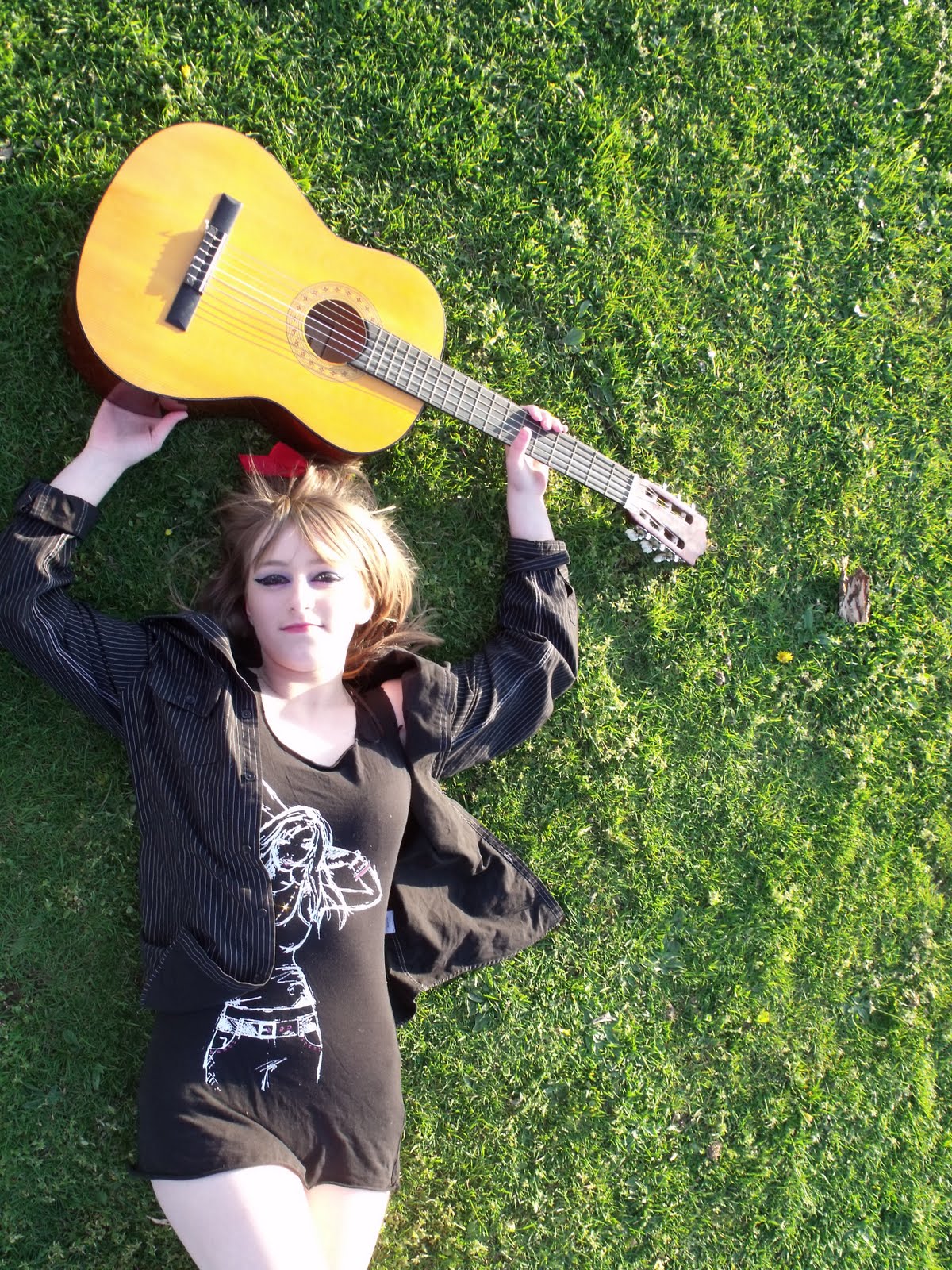